Friday, October 30, 2009

This is my Dad's "VALET" Auto Srop Safety Rozor, in MODEL 'C', it comes complete with tin case and Rodgers Razor Blades, which have all been engraved with 'STAR CROSS SHEFFIELD ENGLAND' and Rodger's in nice curvy type, to ensure quality and have been kept in little paper envelopes in a little brass case with the razor.
The razor itself has also been engraved with the Valet Auto Strop name.
The inside of the case is lined with velvet too keep the razor protected.
It's interesting to own this little piece of history.
I researched this model razor on the internet and from the information I can find it was made around 1907, the time when the Victorian design style was phasing out, so is probably one of the last razor's designed this way.
This is my Mum's little police officer teapot. It's fairly modern however it's design has very art deco influences.
I just find it interesting how the designer has thought to actually make a teapot into a little person, and this teapot is completely useable combining function with an interesting form.
I am not sure how old the teapot actually is but I'm guessing it has influences from England/Europe because of the style of clothing that the policeman is wearing.

Tuesday, October 27, 2009

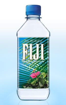
I bought a bottle of water on special the other day and didn't think anything of the design until I picked it up the next day and had a closer look. I was really intrigued by the design so I looked it up on google and decided to write about it in my blog. At first glance all you really notice is a simple bottle of water. The bottle has been decorated with close up image of a palm tree and a picture of a flower along with the text - nothing unusual on a package design. What I did find interesting though was the fact that the background image of the palm tree is actually on the back of the bottle and you can see it by looking through the water. 
Another thing i noticed is the rectangular shape of the bottle with a round lid, very unlike the circular bottle shapes you usually pick up in the supermarket. 
The colours make it a peaceful, relaxing and refreshing design - everything that good water should be. 
Over I like this design, it is expensive water to buy (as you can see by the design) compared to others and i wouldn't have picked it up if it wasn't on special for only $1 :)
This movie poster by graphic designer and film maker Saul Bass was designed for the 1971 movie Such Good Friends.
The design itself is simple yet interesting. The way in which Bass has used simple curved block shapes to look like a pair of woman's legs  almost looks like a stencil print. This has been used as a focus point to the poster and stands out against the vibrant orange background, it's almost a red colour however not as stimulating to the eye as red is.
The way in which the poster has been put together  is so simple looking yet is a complicated design.
The type in all white caps I find interesting because of it's thin italic style, and close spacing looks good against the rest of the orange and black. 
The poster has been finished of with small rows of text at the bottom, which In my opinion the poster would have been better without, however necessary to give the viewer that small amount of information about the film.


Tuesday, October 20, 2009

This p.i.n.k vodka ad shows a photograph of the product (the bottle of vodka) centered against a plain black background. The image of  the bottle has been reflected against the black background at the base of the bottle to give a sense of depth. A pink electrical cord is shown coming out of the back of the bottle, to complement the pink text in the top centre of the ad 'Super-charged'. Underneath the main image (centered) a few sentences of small plain white text have been used to describe the product and the words 'caffeine' and 'guarana' have been highlighted in pink to capture the viewers attention. Further below this is the product logo (also shown on the bottle) which contains the letters p.i.n.k, separated by full stops, all in lowercase also the color pink. directly under this is a catch phrase 'the worlds perfect party spirit' written in the same plan white text used throughout the ad. Further below this is also the fine print also in white. 


The add has a 'central' layout, all elements of the add have been centered and our eye is drawn from the photograph of the bottle in the direct centre, up to the text at the top and then down to the power cord coming from the bottle, and finally to the text at the bottom of the page.


The color of the add has been used to directly draw the viewers attention to the image of the product in the center which highly stands out against the blackness of the background. The color pink has been used to remind the viewer of the name of the product p.i.n.k. Overall the only colors used are black for the background, the pink highlights and the white text. I find this a good way to use color as it isn't overwhelming on the page and draws the attention to the viewer. Pink is also a good color to use as it promotes femininity and targets the female audience.