Tuesday, October 27, 2009

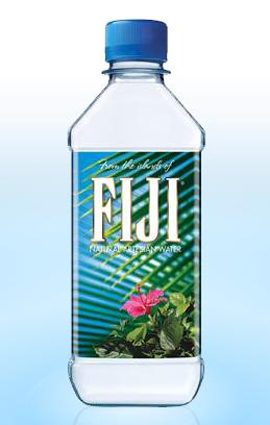
I bought a bottle of water on special the other day and didn't think anything of the design until I picked it up the next day and had a closer look. I was really intrigued by the design so I looked it up on google and decided to write about it in my blog. At first glance all you really notice is a simple bottle of water. The bottle has been decorated with close up image of a palm tree and a picture of a flower along with the text - nothing unusual on a package design. What I did find interesting though was the fact that the background image of the palm tree is actually on the back of the bottle and you can see it by looking through the water. 
Another thing i noticed is the rectangular shape of the bottle with a round lid, very unlike the circular bottle shapes you usually pick up in the supermarket. 
The colours make it a peaceful, relaxing and refreshing design - everything that good water should be. 
Over I like this design, it is expensive water to buy (as you can see by the design) compared to others and i wouldn't have picked it up if it wasn't on special for only $1 :)
This movie poster by graphic designer and film maker Saul Bass was designed for the 1971 movie Such Good Friends.
The design itself is simple yet interesting. The way in which Bass has used simple curved block shapes to look like a pair of woman's legs  almost looks like a stencil print. This has been used as a focus point to the poster and stands out against the vibrant orange background, it's almost a red colour however not as stimulating to the eye as red is.
The way in which the poster has been put together  is so simple looking yet is a complicated design.
The type in all white caps I find interesting because of it's thin italic style, and close spacing looks good against the rest of the orange and black. 
The poster has been finished of with small rows of text at the bottom, which In my opinion the poster would have been better without, however necessary to give the viewer that small amount of information about the film.


Tuesday, October 20, 2009

This p.i.n.k vodka ad shows a photograph of the product (the bottle of vodka) centered against a plain black background. The image of  the bottle has been reflected against the black background at the base of the bottle to give a sense of depth. A pink electrical cord is shown coming out of the back of the bottle, to complement the pink text in the top centre of the ad 'Super-charged'. Underneath the main image (centered) a few sentences of small plain white text have been used to describe the product and the words 'caffeine' and 'guarana' have been highlighted in pink to capture the viewers attention. Further below this is the product logo (also shown on the bottle) which contains the letters p.i.n.k, separated by full stops, all in lowercase also the color pink. directly under this is a catch phrase 'the worlds perfect party spirit' written in the same plan white text used throughout the ad. Further below this is also the fine print also in white. 


The add has a 'central' layout, all elements of the add have been centered and our eye is drawn from the photograph of the bottle in the direct centre, up to the text at the top and then down to the power cord coming from the bottle, and finally to the text at the bottom of the page.


The color of the add has been used to directly draw the viewers attention to the image of the product in the center which highly stands out against the blackness of the background. The color pink has been used to remind the viewer of the name of the product p.i.n.k. Overall the only colors used are black for the background, the pink highlights and the white text. I find this a good way to use color as it isn't overwhelming on the page and draws the attention to the viewer. Pink is also a good color to use as it promotes femininity and targets the female audience.

Tuesday, August 25, 2009

I was drawn to this victorian style coca cola poster because of its elegant victorian style and it's use of rich burgundy reds and peachy pinks.  Also the fact that a glass of coke only costs like 5c!!!! 

Tuesday, August 18, 2009

I LOVE this poster!! It's a psychedelic poster for a James Brown concert in the 1960's. It caught my attention because of the way the words have been 'squeezed' into the shape of the face, and that they are difficult to read. I also like the black silhouette of the James Brown against the masses of blue text fanning outwards.
I did a google search on the singer and came across another one of his posters in a similar style. This time it is black, purple and peach but still has the same silhouette of Brown, filled in with unreadable masses of writing. 
The design itself is psychedelic, funky and 'different' however it is very overwhelming and confusing so I don't think it's a very good poster for advertising the concert.


Tuesday, August 11, 2009

Psychedelic Hendrix Poster

While researching the Psychedelia design movement of the 1960's and early 1970's, I found this Jimmi Hendrix poster on google and it caught my attention because of it's 'psychedelic' design, the colours, typography and the two-colour image of Hendrix.
What I believe is most appealing is split-complementary use of colour (the orange complemented with the purple and aqua-blue). The poster was most probably aimed at the younger generation of the 60's and early 70's because it is relatable to the 'hippy' youth culture of the time. 
The typography is also interesting as it is in the psychedelic 'unreadable' style. It is made to be easily read and interesting for the youth, and hard to understand and confusing for the elderly. This is a characteristic of most psychedelic designs, which 'squeeze' text into the most abnormal shapes to make it difficult to read at first.
The use of the black border is nice as it 'breaks up' some of the colour and is more pleasing to the eye than the rest of the poster.
Overall the design is spontaneous and loud and it was because of this that attracted me to the piece.

Monday, August 3, 2009

Nina Ricci Perfume


ok after quite some time trying to figure out how to change the file size of this image i have finally managed to upload it, the photo however, is not meant to be blue!!! Ok so if you can imagine all the blue being red.... you get the idea....

So I was given this bottle of perfume as a prezzie, and decided to write about it as i really like the packaging design and the shape of the actual perfume bottle which is the shape of an apple. The packaging itself is a white, rough textured box with the basic shape of a red apple surrounded with a silver brush stroke and a silver leaf. I think it is really well done, despite the fact it is so simple. Even the print 'Nina' has been used in an elegant font to match the rest of the elegant design of the packaging.